|
|
|
Assignment 3: Business
Intelligence/Visualizing Sales Data using
Tableau
NOTE: All
assignments are individual work.
You may NOT collaborate with your fellow
students, share files or results of any kind. If
you need help see your instructor or TA.
Purpose
This assignment is designed for you to understand
and gain experience with:
1) using a business intelligence and data
visualization tool--Tableau
2) how the extract-transform-load (ETL) process
works with business data;
3) analyzing data to answer business-relevant
questions;
4) presenting practical, business-relevant data
analytics in a visually appealing dashboard.
Task Description
The company that you work for, OfficeStuff,
for sells office supplies, furniture, and equipment
(think Office Depot) in the US. OfficeStuff
has been collecting transactional data on all of its
sales for several years. Your job, as a data
analyst, is to analyze the collected
data to identify problems and opportunities,
to create a dashboard to help visualize and
communicate this information, and to create a report
on your findings. The dashboard and the report are
meant to be shared with management, to help them
make decisions.
Each of the analyses and visualizations described
below should be done on a separate worksheet in
Tableau. And based on these analyses you need to
answer some business questions in your report.
These worksheets, and associated questions, are as
follows:
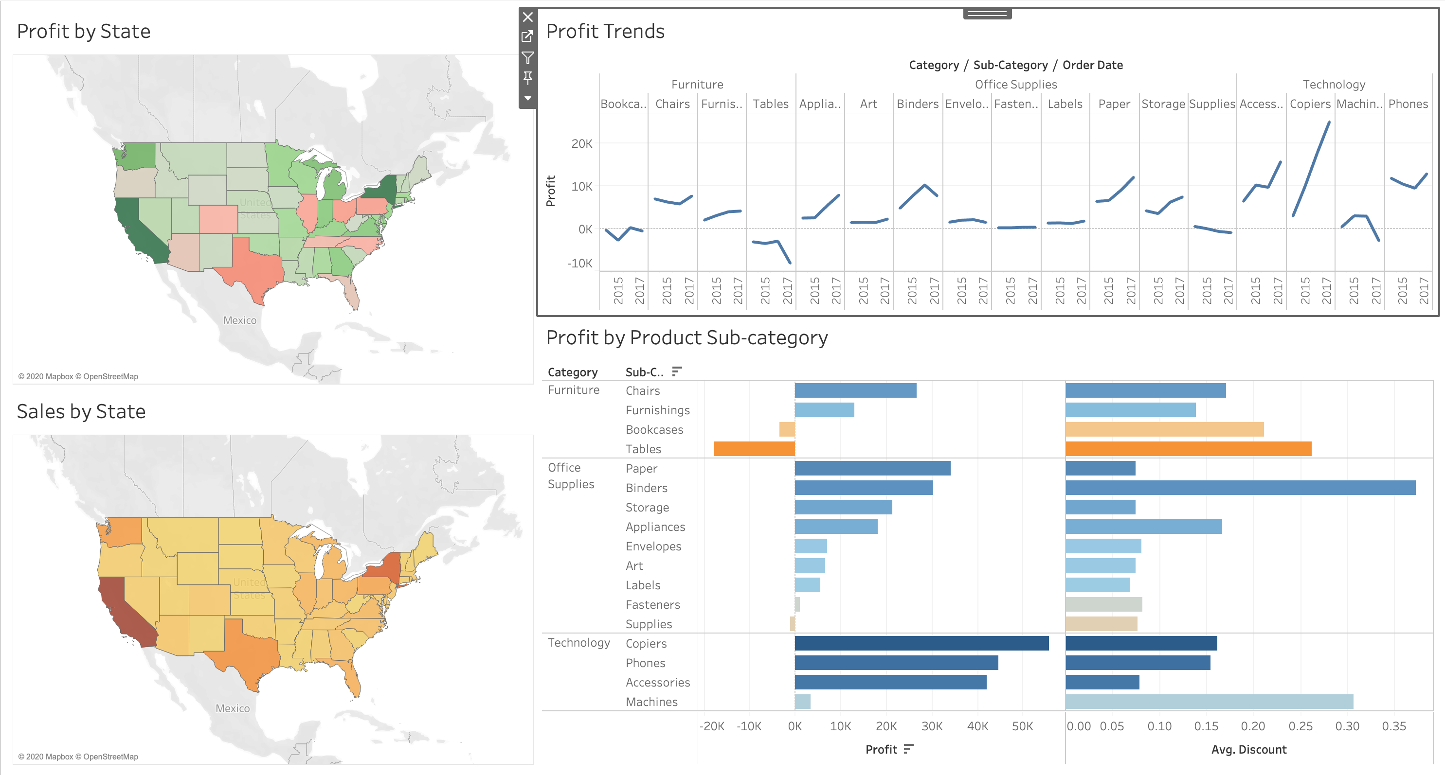
1) Sales by State
- visualize state-by-state sales data on a map
- based on this analysis, which states are doing
best from a sales perspective? List the top
5 and say how you determined them.
2) Profitability by State
- visualize state-by-state profitability data on a
map; use a different color scheme than the one you
used for exercise 1)
- based on this analysis, which states are most
problematic from a business profitability
perspective? List the top 5 and say how you
determined them.
3) Profitability/Discounts by Product
Category/Sub-category
- visualize your products by category and
sub-category, as horizontal bar charts.
- what product categories are most problematic
from a profitability
perspective?
- what product sub-categories are most problematic
from a profitability
perspective?
- why are these sub-categories problematic? (Hint:
look at discounts and visualize this information)
4) What are the trends of profit/loss for each
Category/Sub-category
- visualize these profit trends as a line graph
for each sub-category over the years
- what product sub-categories made the biggest
increases/decreases in 2017?
In addition to these worksheets you should create
a dashboard for OfficeStuff management
consisting of: i) two maps - profitability by
state and sales by state; ii) profit trends; and
iii) profit and discount by product category and
sub-category. An example of what such a dashboard
might look like is shown below:
Notes:
1) your dashboard does not need to look exactly
like this. But it does need to contain all
of the relevant parts.
2) make sure that you have included all of the
sheets in what you submit. On Tableau
Public, click on the gear icon  on your
visualization page and select "Show Sheets". on your
visualization page and select "Show Sheets".
Help for the
assignment:
Tableau provides a rich set of
tutorials
on their web-site. There are many other
online tutorials as well, such as TutorialsPoint.
And, as always, feel free to ask your instructor
any questions.
Submission:
Electronic submission only.
1) Submit the URL of your Tableau Public project.
2) Submit a writeup that provides the answers to
the above questions.
Remember that, as with all assignments, you should
apply professional business writing skills.
Make sure that your writeup has a cover page and
is professionally presented with an introduction,
main body, and conclusions. Make sure it is
grammatical, and is spell-checked. Do not
submit bullet points!!
The late assignment policy will
be strictly followed.
Grading Scheme: (100
points)
- Four worksheets: 50
points
- Dashboard: 20
points
- Written Report: 30
points
BONUS points available (up to 20 points):
- for providing additional interesting
visualizations that go above and beyond what is
described here.
|